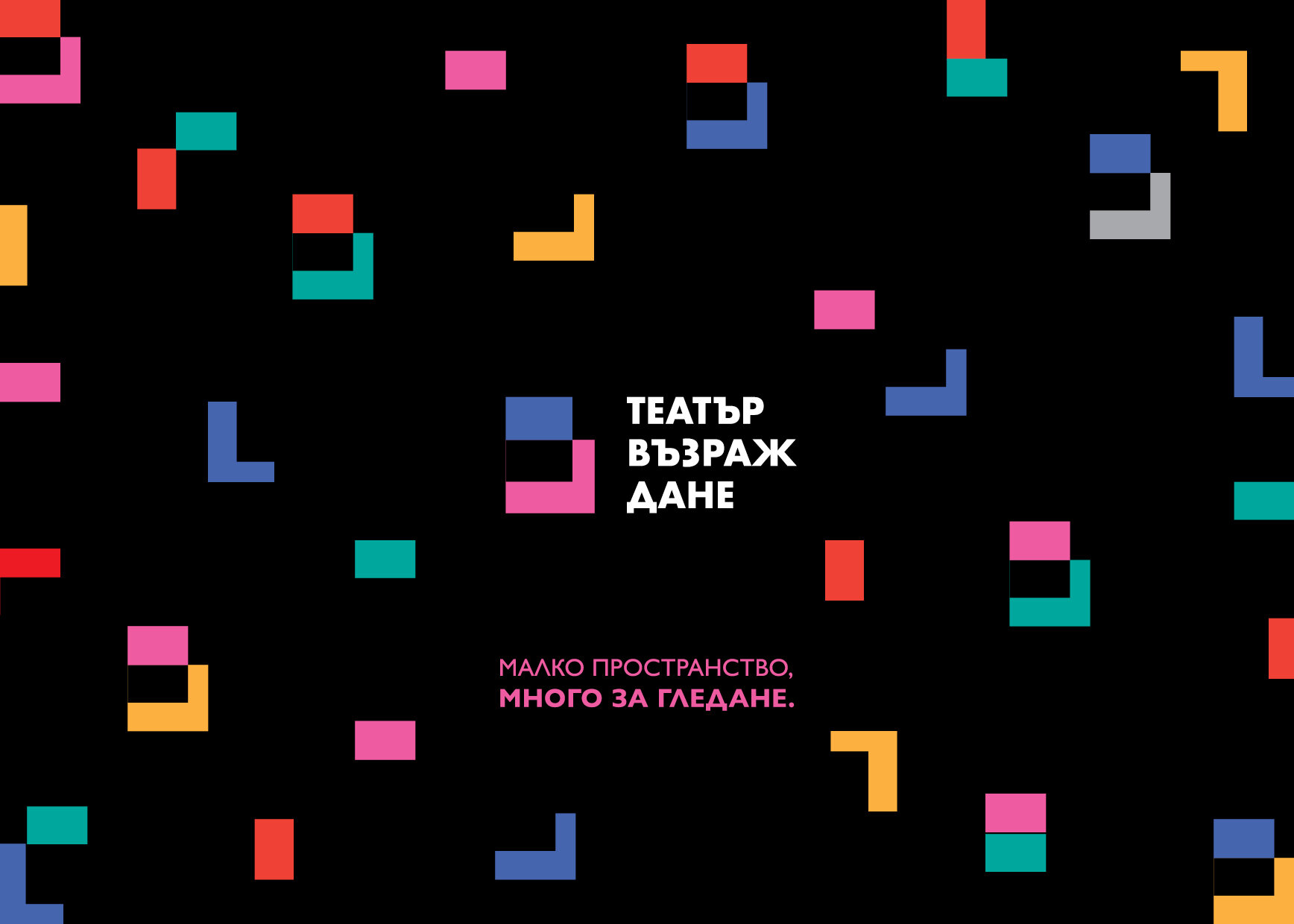
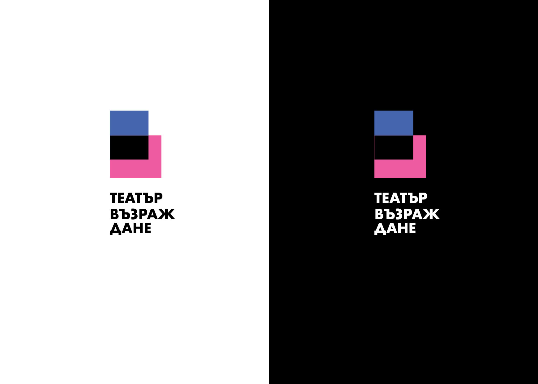
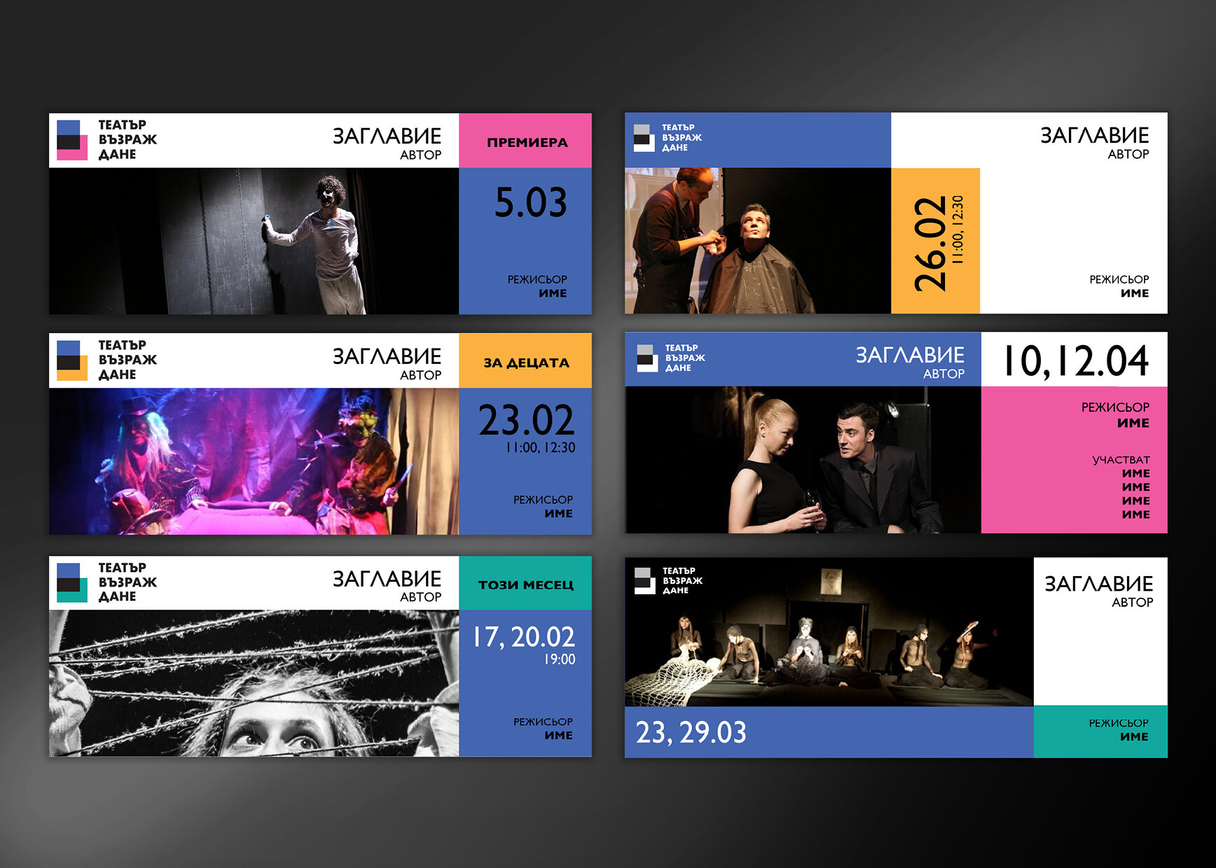
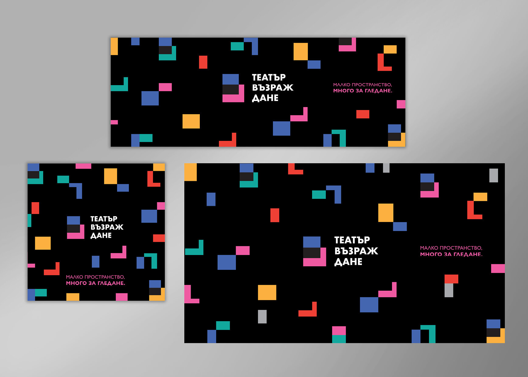
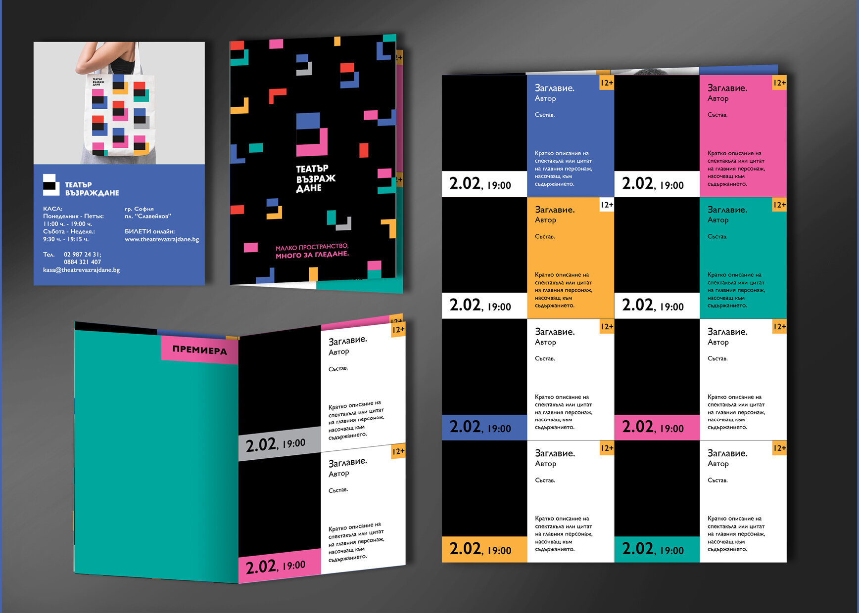
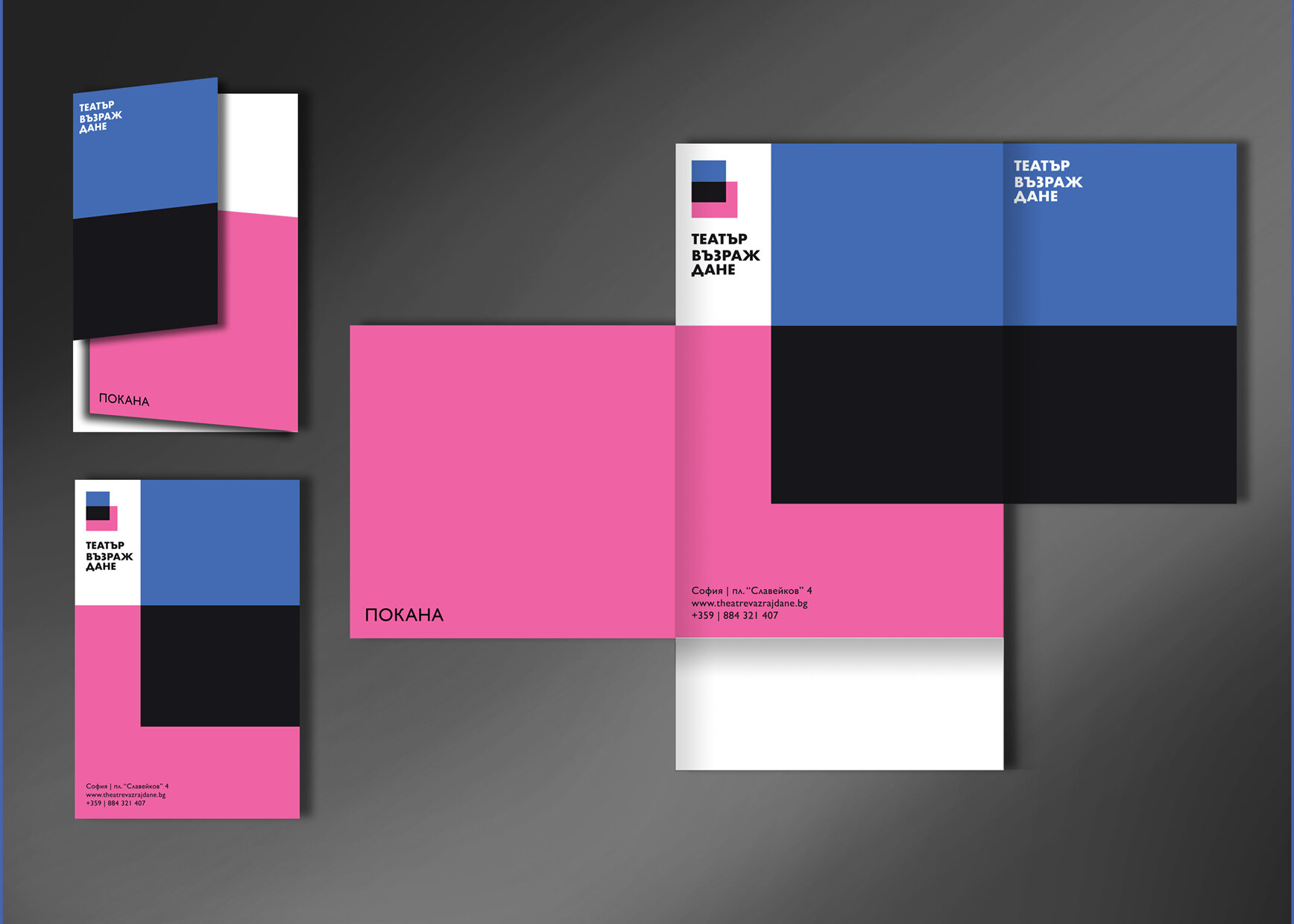
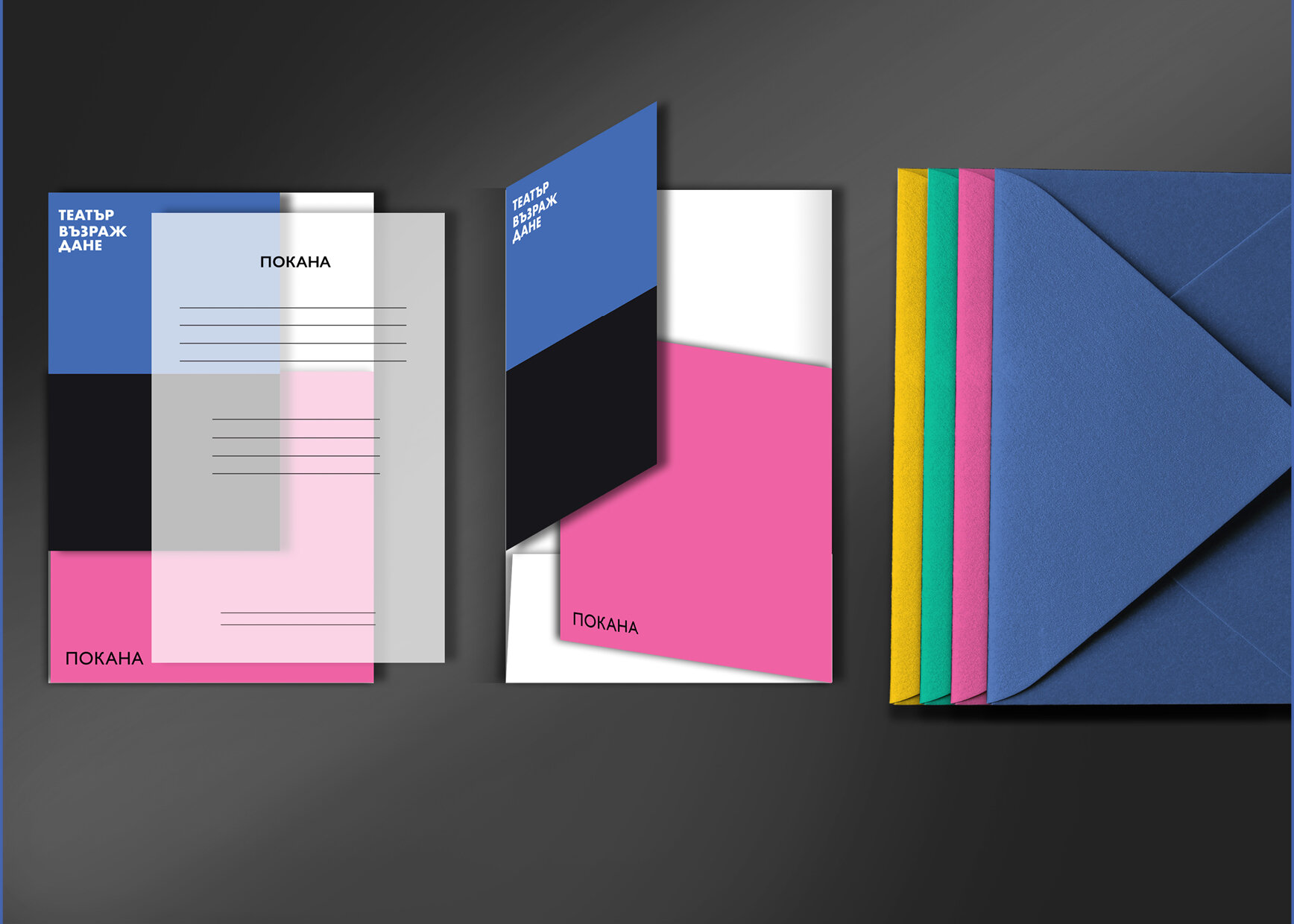
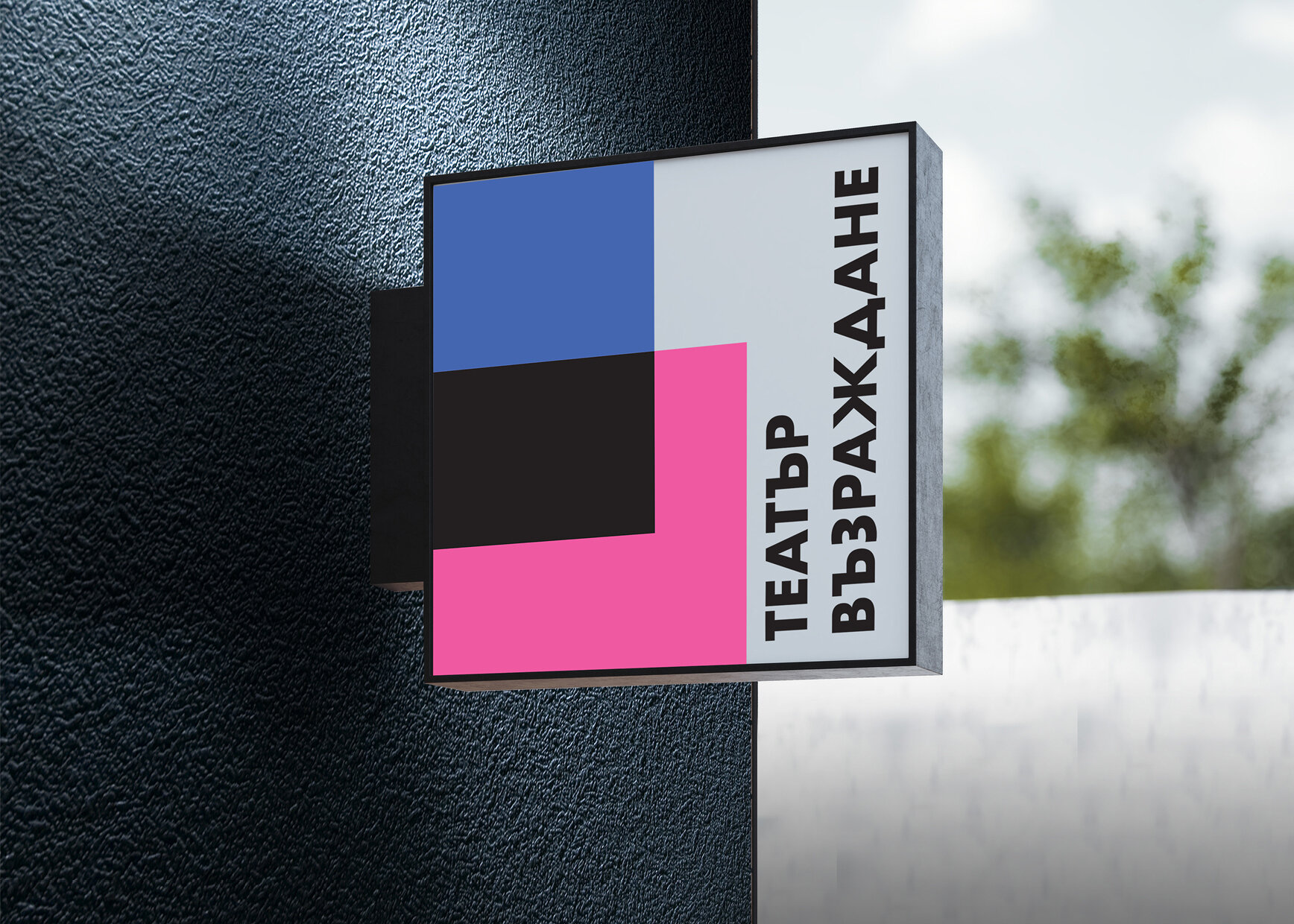
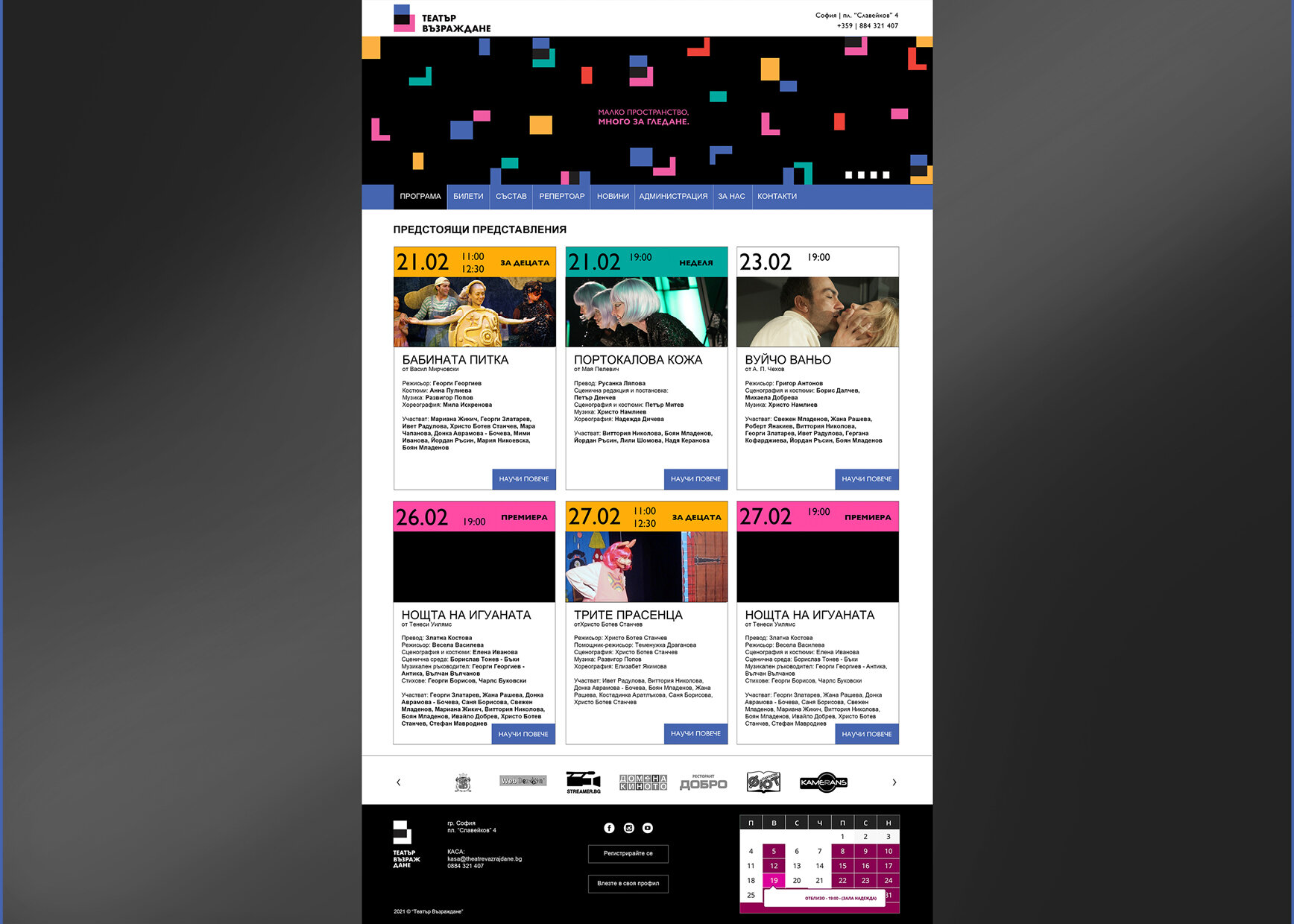
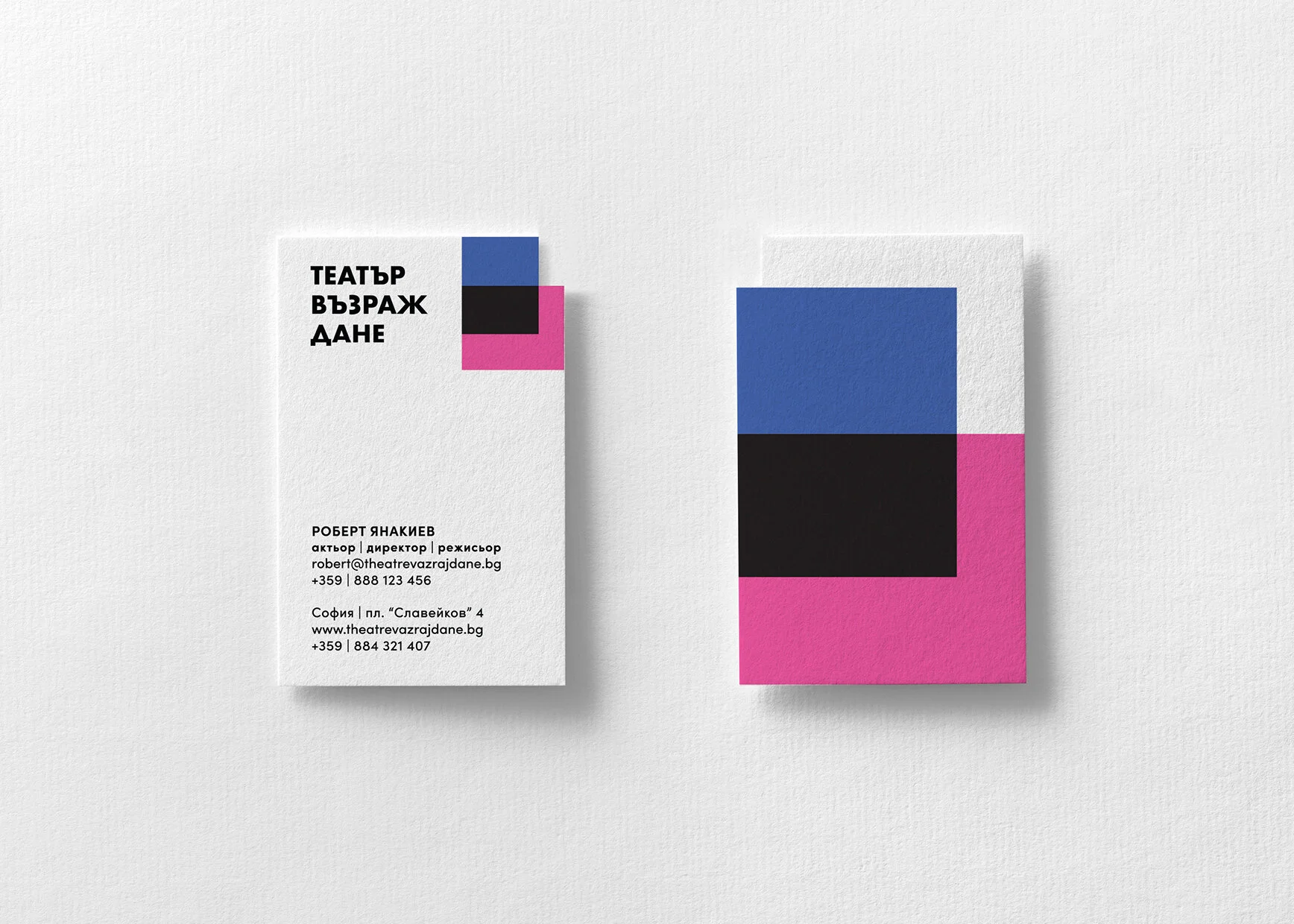
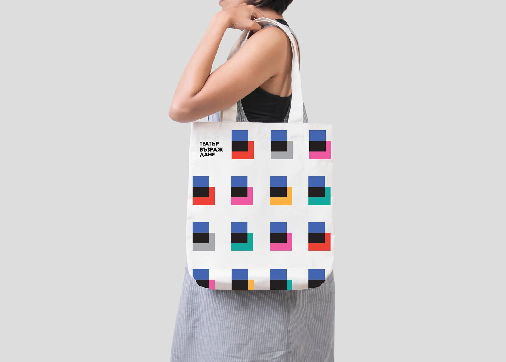
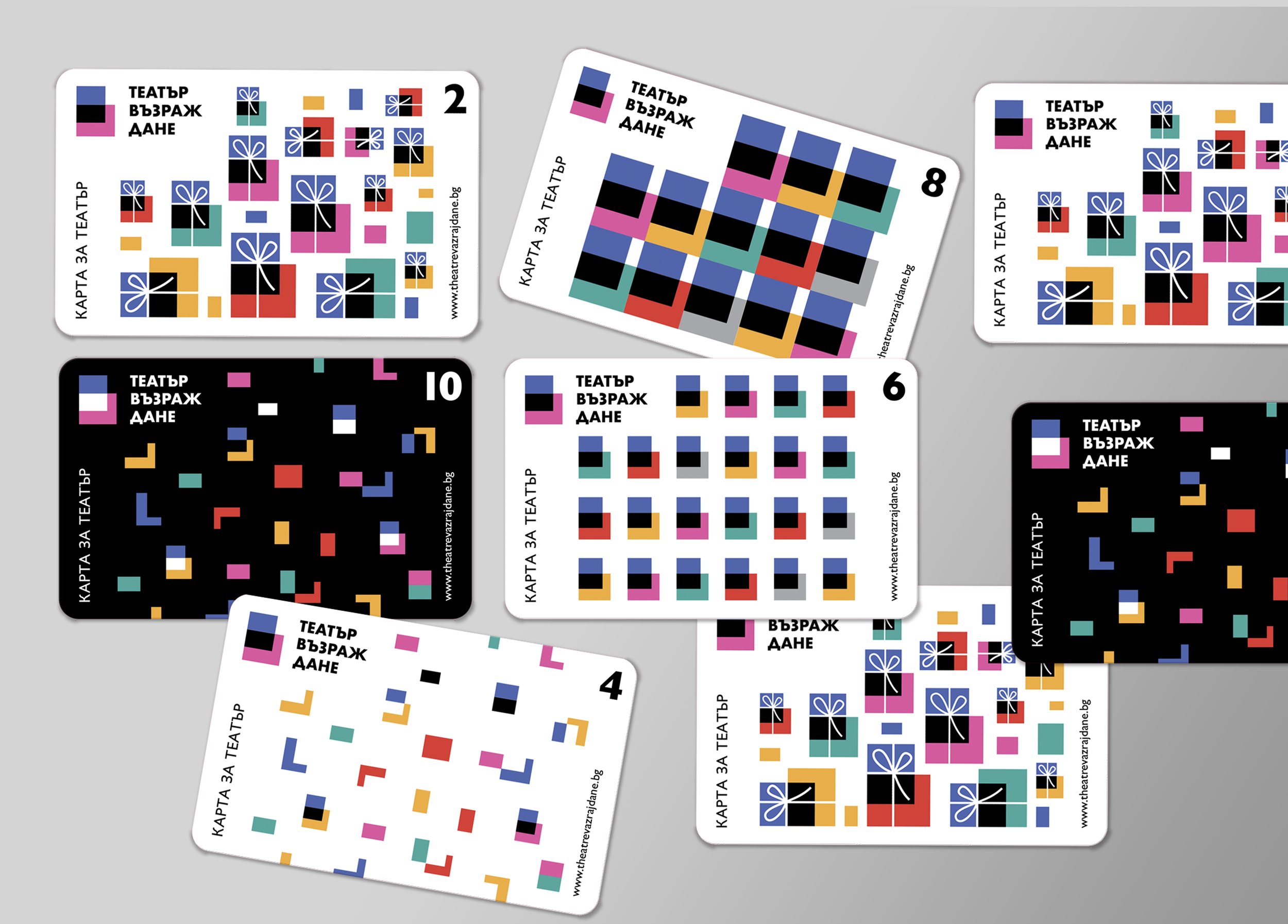
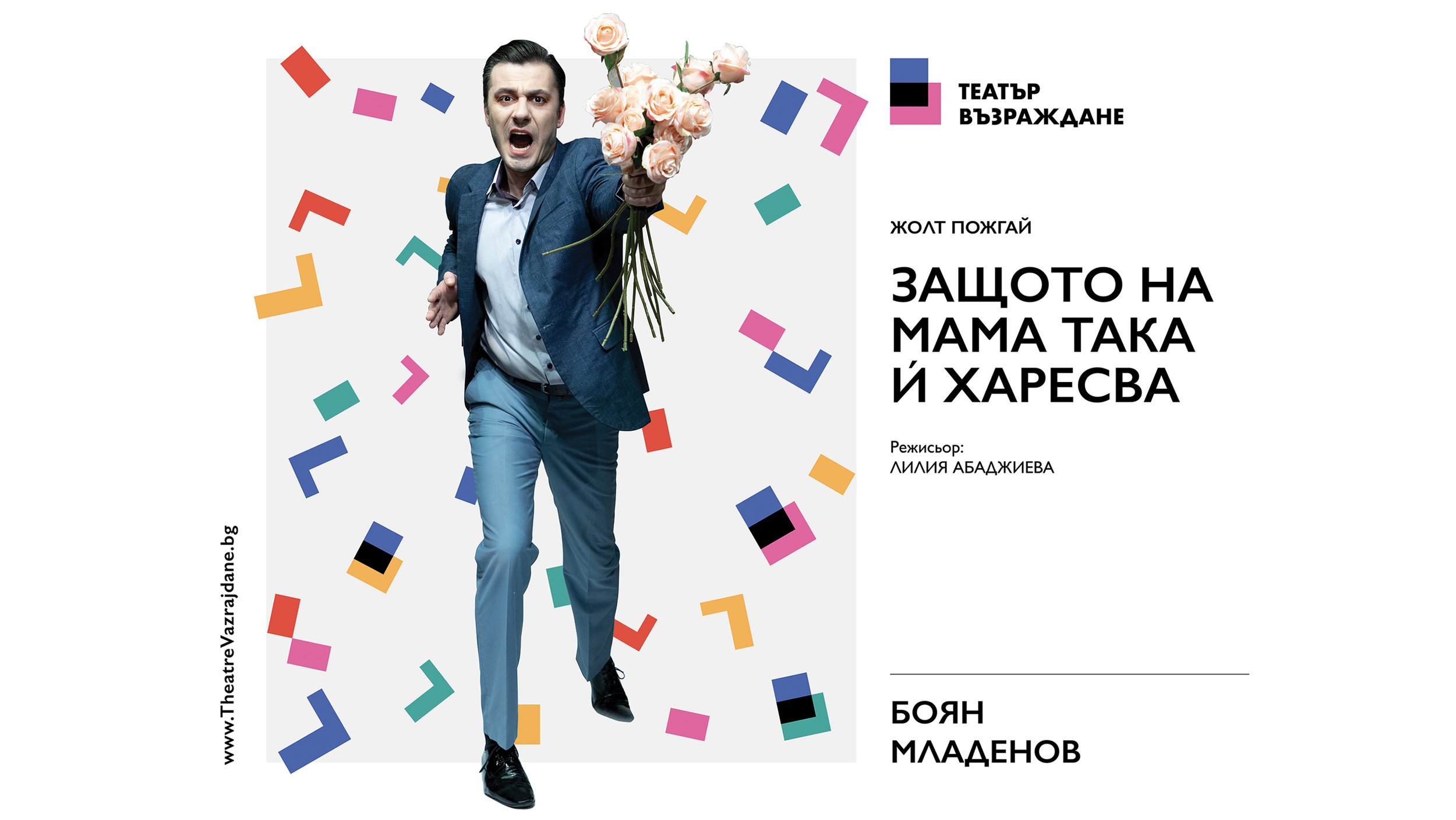
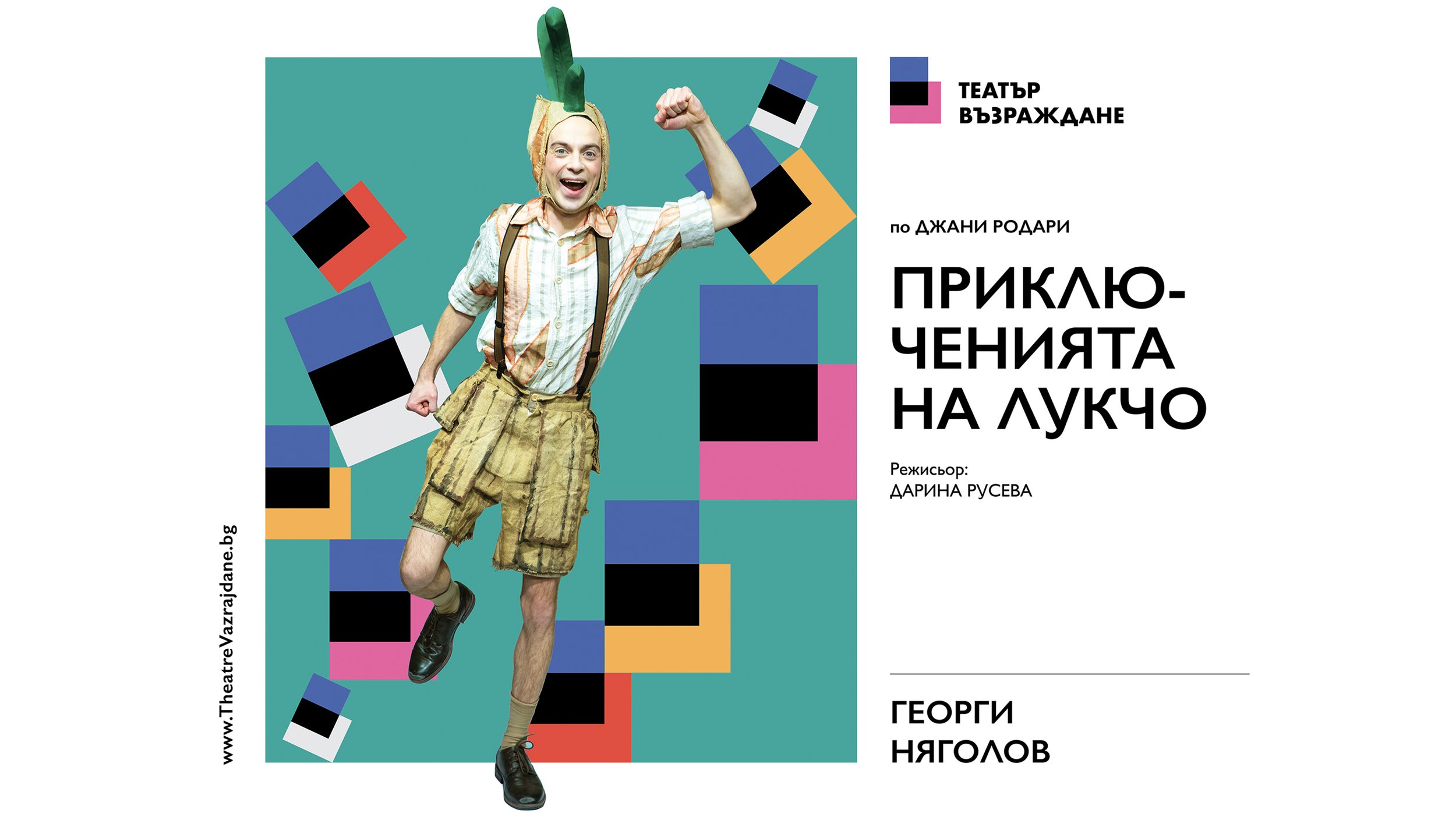
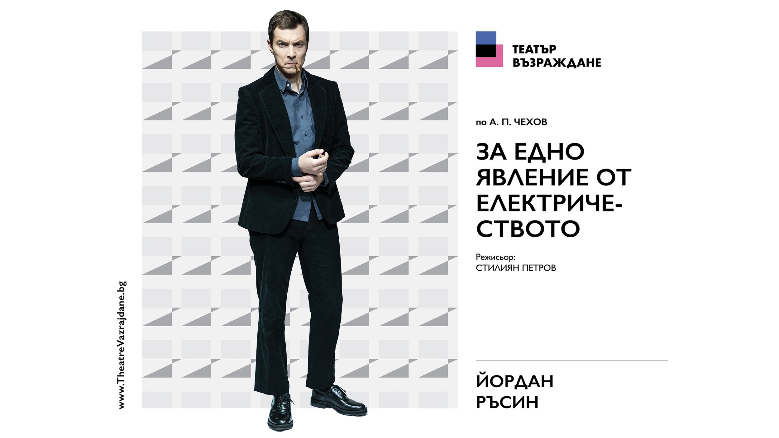
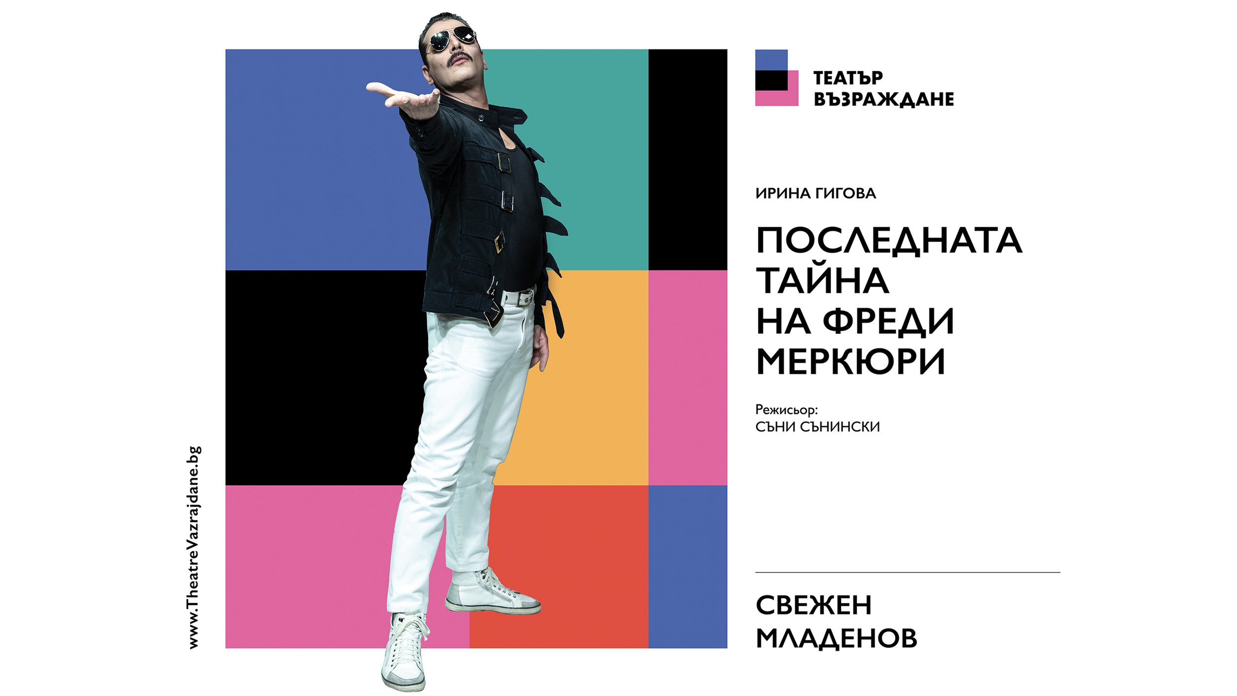
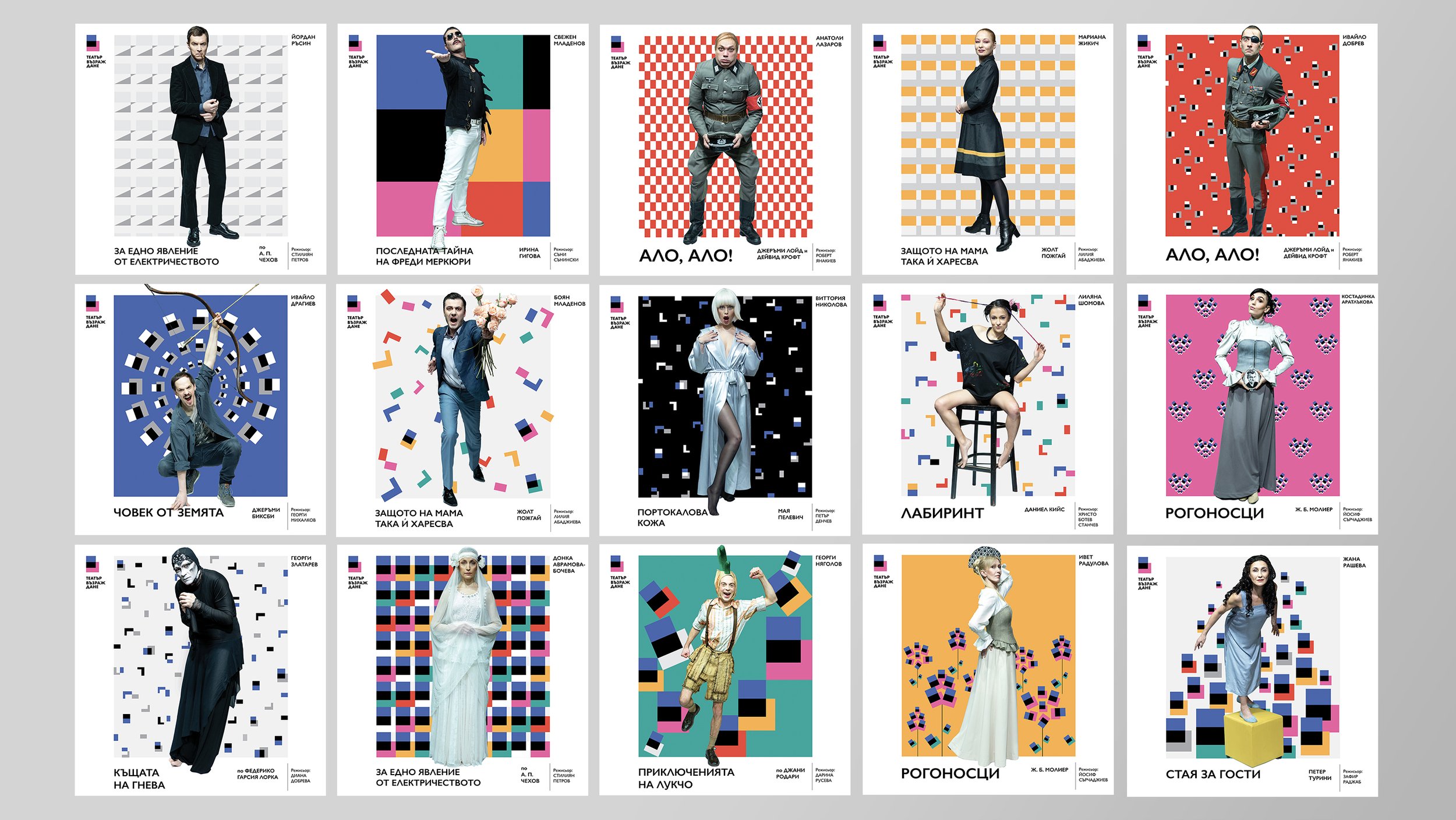
Logo and graphic style for Vazrazhdane Theater, Sofia.
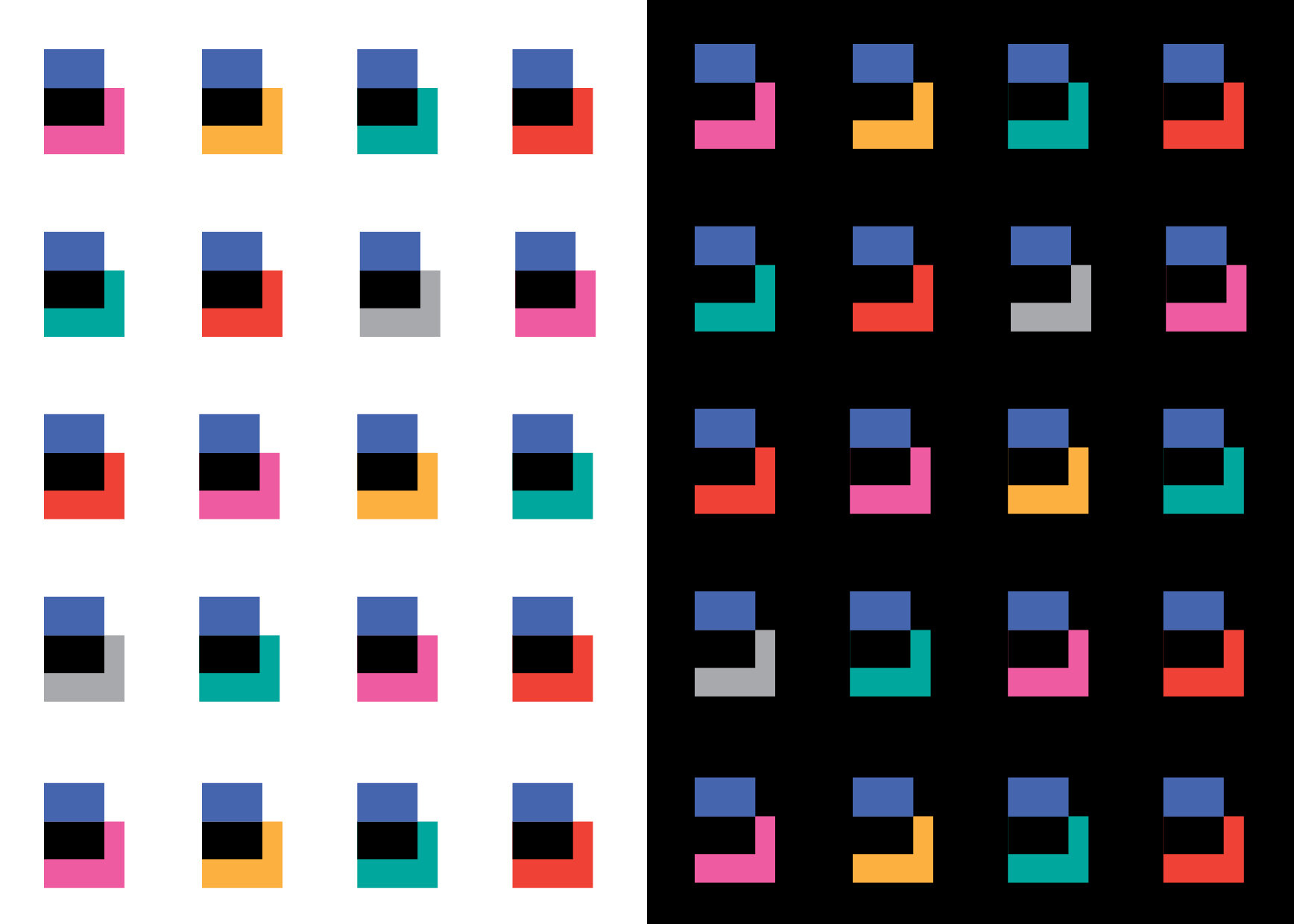
The concept of the logo derives from the specifics of the theater - a small chamber space with black walls, wedged in the large building of the Sofia Library. It also represents a stylized B. The logo can change its colors at the bottom, as each color is a coded message - yellow - performances for children, pink - premieres, etc. The graphic style spreads from the street, through the printed materials and the internet advertising of the theater - consistent, different, recognizable and multicolored. As a distinguishing feature we use the black background - like the walls of the theater and the darkness, after turning off the lights. The graphic style of the materials comes from the shapes of the logo. For example, the folded printed invitation represents the logo itself.
